Brent Crude Oil Price History and Cycles
The major moves in Brent since the 1970s, what caused each, and the pattern that keeps repeating.
 Rayner5 min read13 September 2026
Brent crude oil price history is worth knowing for one reason: the same two situations keep producing the same two shapes. A supply shock spikes the price violently and unwinds within months. A demand collapse takes it lower and keeps it there for years.
Knowing which one you are looking at tells you whether a move is likely to hold. This page walks through the major cycles, what caused each, and what the pattern means for reading a move happening right now.
Brent crude has moved through repeated cycles driven by supply shocks and demand collapses. Supply shocks spike hard and usually unwind within months. Demand collapses fall further and take years to recover, which is the most consistent pattern in the price history.
The two shapes that keep repeating
| Supply shock | Demand collapse | |
|---|---|---|
| Cause | Barrels stop flowing | Consumption falls |
| Move | Sharp spike up | Sustained fall |
| Speed | Days to weeks | Months |
| Duration | Usually unwinds within months | Often years |
| What ends it | New supply, or the disruption resolving | Supply shutting down, or demand returning |

That distinction is the practical use of the whole subject. A rally on a supply headline is a different proposition to a rally on returning demand, and they behave differently for a reason.
The 1970s: the original supply shocks
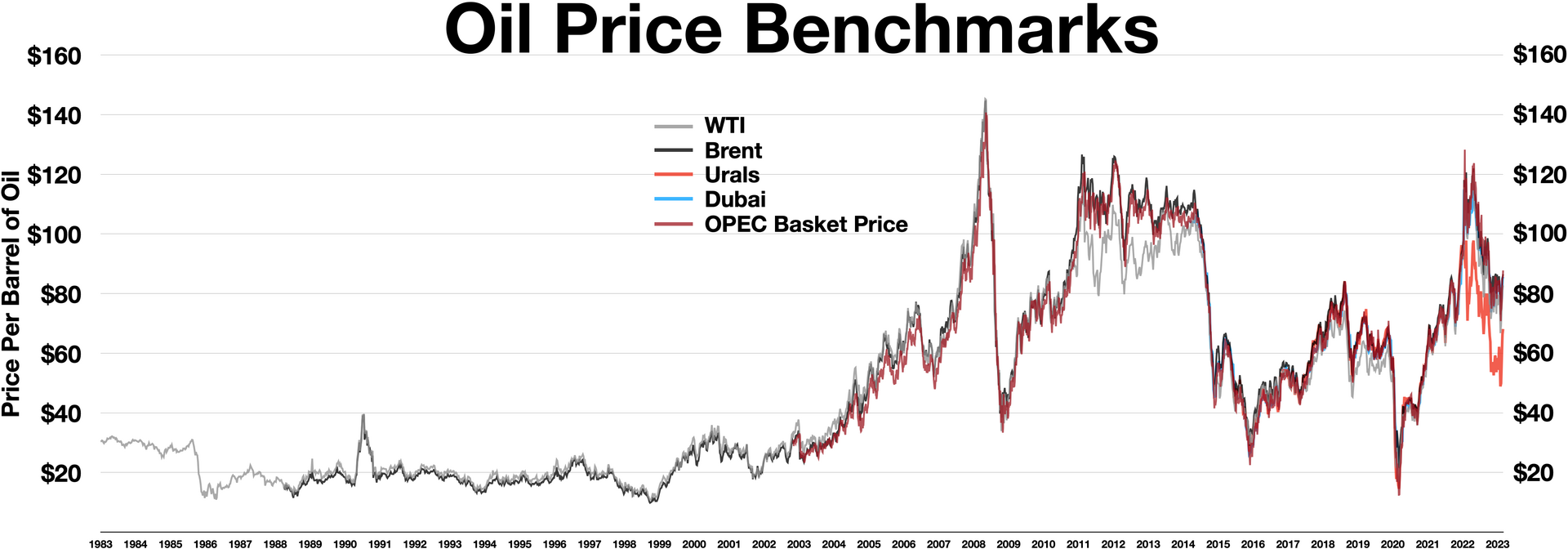
Two episodes within a decade, both driven by producing countries restricting supply for political reasons. The price rose several times over and stayed elevated for years.
What ended it was the classic mechanism: very high prices made expensive production economic, new supply arrived from regions that had not been worth developing, and demand adapted through efficiency. Both took years, which is why this one broke the usual short spike pattern.
The 1980s and 1990s: the long hangover
All that new supply arrived at once into demand that had permanently adjusted. The price fell heavily and stayed low for most of two decades, with occasional spikes on regional conflicts that faded within months.
This is the clearest illustration of how slowly the cycle corrects. Supply decisions take years to play out, so an imbalance can persist far longer than a chart suggests it should.
The 2000s: the demand decade
Rapid industrialisation in Asia, particularly China, added demand faster than supply grew. The price rose for most of a decade with relatively few interruptions.
It ended in the financial crisis, which is the cleanest demand collapse in the record. Consumption fell sharply, the price fell with it, and the recovery took the following years as demand returned.
The 2010s and 2020s
Two more turns of the same wheel. US shale production grew enough to change the global balance, which pushed the price down and prompted a long argument among producers about who should cut.
Then the 2020 demand collapse, sharper and faster than anything before it, followed by a recovery that overshot as supply struggled to restart. The 2022 period added a supply shock on top of a recovering demand picture, which is why it moved so far.
Supply shocks unwind in months. Demand shifts take years. That single distinction explains most of the price history.
What history is actually good for
- Telling a supply move from a demand move, which predicts how long it lasts
- Knowing the cycle is self correcting, so extremes in either direction tend not to persist
- Understanding why a geopolitical spike fades while a demand trend does not
- Predicting a price level, since the range oil trades in has shifted several times
- Assuming a previous high or low is a level today
- Any forecast built on a cycle repeating to a schedule
History gives you shape and probability. A trade needs a level, a stop and a ratio, and none of those come from a long term chart. How forecasts get built from this material is in crude oil price forecast, and the current drivers are in what moves the crude oil price.
Keep reading
- What moves the crude oil price the drivers behind each cycle
- Crude oil price forecast how this history gets turned into a target
- WTI vs Brent why the two benchmarks price differently
- OPEC decisions and oil trading the supply side of most of these cycles
Frequently Asked Questions
What causes the biggest moves in oil history?
Supply shocks and demand collapses. Supply shocks spike the price sharply and usually unwind within months, while demand collapses fall further and take years to recover.
Why do oil price spikes fade?
Because high prices bring out new supply and encourage efficiency, both of which take time but arrive eventually. The cycle is self correcting, just slowly.
What ended the 1970s oil price rises?
New production from regions that were not economic at lower prices, plus demand adapting through efficiency. Both took years, which is why that period stayed elevated far longer than a typical supply shock.
Why was 2020 different?
It was a demand collapse rather than a supply shock, and a sharper one than anything before it. Consumption fell very fast, and the recovery then overshot because supply struggled to restart at the same pace.
Does oil follow a predictable cycle?
It follows a self correcting mechanism rather than a schedule. High prices call out supply and low prices shut it down, but the timing varies by years and cannot be forecast from the chart.
Can I trade based on oil price history?
Only as context. History tells you whether a move is likely to last, which is genuinely useful, and it gives no entry, no stop and no risk to reward ratio.
Are old highs and lows useful levels?
Rarely on a multi decade view, because the range oil trades in has shifted several times. Levels from recent months and weeks are far more reliable for an actual trade.